


How to Choose the Perfect Children's Book Font
Let's be honest, picking a font for a children's book feels like a huge deal. It’s about striking that perfect balance between something that’s easy to read and something that practically sings with personality. You want a font that’s clean and friendly, like a warm hug on the page—think a welcoming sans-serif like Poppins or a gentle serif like Lora. The goal is to make the words feel inviting, not like some tricky puzzle your little reader has to solve.
The Hidden Magic in Every Letter
Welcome to the wonderful, often-overlooked world of children's book typography! It's the unsung hero of every great story, the secret sauce that makes the reading experience truly special. The right children's book font does so much more than just form words on a page. It sets the tone, ignites a child's imagination, and helps turn reading from a task into a thrilling adventure.
Think of it this way: the font is the story’s voice. Before a single word is read aloud, that font can whisper that the story is playful, serious, whimsical, or comforting.
This guide is your compass. We'll start with the basics of what makes a font legible for kids and journey all the way to the art of pairing typefaces and handling the nitty-gritty technical details. Getting this right is a game-changer for authors and publishers trying to make their mark.
Why Your Font Choice Matters So Much
A great font is the bedrock of a positive first reading experience. It’s what helps a child connect the dots between the story you’ve written and the beautiful illustrations on the page. Just like the words in our personalized Chanukah adventure storybook guide kids through a festival of lights, the right font makes that journey effortless and fun.
This isn’t just about artistry; it's a smart move in a massive industry. The global children’s book market hit around USD 660 million in 2023 and is only getting bigger. Publishers know that choosing fonts for maximum readability is key to creating a better learning experience—a huge factor in this booming market. You can find more fascinating stats on the children's book market over at growthmarketreports.com.
Typography is the visual voice of the written word. For children, this voice needs to be clear, encouraging, and full of character to draw them into the magic of a story.
At the end of the day, you’re looking for a typeface that lifts your story up without stealing the show. Let's dive in and find out how the perfect font can take your book from just being read to being truly loved.
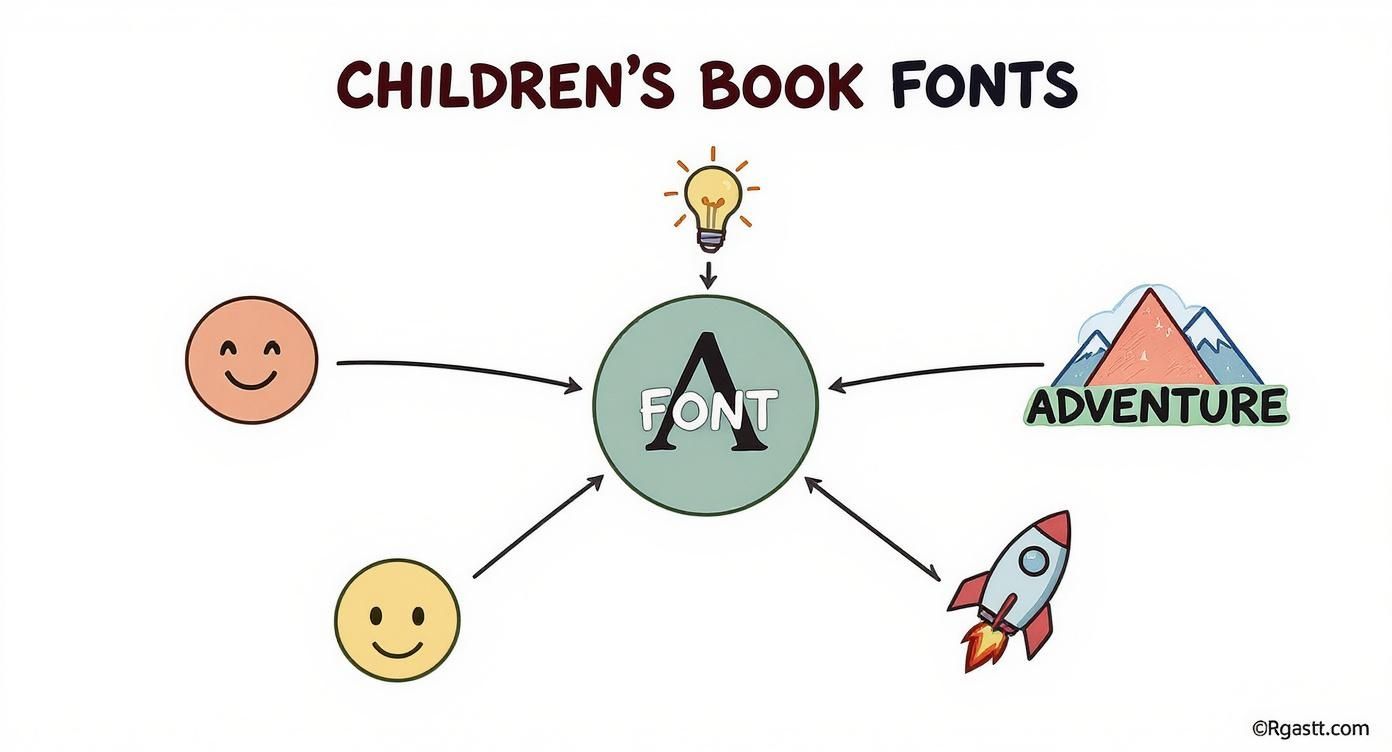
The Five Pillars of a Reader-Friendly Font
Picking the perfect children's book font is a lot like casting the right narrator for your story. Some fonts speak with a clear, inviting voice that draws kids in, while others can feel a bit mumbly or even intimidating. To find that perfect voice, you need to understand the five essential pillars that make a font truly sing for a young audience.
Think of these pillars as a font’s personality traits. Get them right, and the text becomes an open invitation for a child to dive headfirst into your world. Get them wrong, and you’ve put a frustrating barrier between them and the magic of your story.
Let's break down what makes a font work.
1. Legibility: The Art of Speaking Clearly
First up, and most importantly, is legibility. This is simply how easy it is to tell one letter from another. For a child who's just learning to sound out words, this is absolutely non-negotiable.
If a lowercase ‘h’ looks too much like a ‘b’, or an ‘r’ and an ‘n’ mush together into an ‘m’, you're setting them up for frustration. The goal is pure, unapologetic clarity. Each letter needs to stand on its own, proud and unmistakable, creating a smooth runway for reading to take off.
2. X-Height: The Heart of the Letter
Next, let’s talk about something called x-height. It sounds technical, but it’s a simple idea. Picture the lowercase letters in a font—the x-height is the height of the main body of those letters, like the 'x,' 'a,' or 'c.'
A font with a generous, tall x-height has a bigger, more open "heart." This makes the entire font feel larger and friendlier, even at smaller sizes. It’s one of those subtle details that makes a massive difference.
A larger x-height creates more white space inside the letters themselves, which is a huge boost for character recognition. For little eyes just learning the ropes, this dramatically cuts down on reading fatigue.
This is exactly why fonts like Andika or Sassoon Primary are rockstars in educational settings. Their tall x-heights make the text feel airy, open, and incredibly welcoming.
3. Letterforms: The Font's Unique Character
Letterforms are just the specific shapes of the letters, and for young readers, familiarity is everything. Most kids are taught to write using very simple, basic shapes, especially for the lowercase 'a' and 'g'.
- Single-story 'a': This is the simple "ball-and-stick" ‘a’ that kids learn to write in school. It’s instantly recognizable.
- Double-story 'a': This is the fancier version with two loops you see in fonts like Times New Roman. It can genuinely trip up an early reader who hasn't encountered it before.
When you choose a font with familiar, kid-friendly letterforms, you’re speaking their language. You're removing a tiny bit of friction and making the journey from page to imagination that much smoother. It's about matching what they see on the page with what they're learning in the classroom.
This is all about how the font's character connects to the story's mood, sparking imagination and a sense of adventure.
As you can see, every single typographic choice helps shape how a child connects with the story on an emotional level.
4. Weight & 5. Spacing: Strength and Personal Space
Finally, let’s look at the font's weight (how thick or thin the letters are) and its spacing (the room between letters and lines). These two work together like a team.
An ideal children's book font has a consistent, medium weight—not so thin that it feels fragile and disappears into the page, but not so bold that the letters feel heavy and crowded. You want it to feel sturdy and confident.
Generous spacing, both between letters (tracking) and between lines of text (leading), gives the words room to breathe. This is crucial! It prevents the page from looking like a dense, scary wall of text and instead gently guides a child’s eye from one word to the next.
Let's pull all these ideas together. When you're looking at a font, you're essentially checking its report card on these key characteristics.
Key Font Characteristics for Young Readers
| Characteristic | What It Means | Why It Matters for Kids |
|---|---|---|
| Legibility | How easily letters can be told apart from each other. | Reduces confusion and frustration, making it easier for kids to decode words successfully. |
| X-Height | The height of the main body of lowercase letters. | A taller x-height makes text appear bigger and clearer, improving readability. |
| Letterforms | The specific shapes of the letters (like 'a' and 'g'). | Familiar, simple shapes (like a single-story 'a') match what kids learn in school. |
| Weight | The thickness of the letter strokes. | A consistent medium weight is sturdy and easy to see without overwhelming the page. |
| Spacing | The room between letters, words, and lines. | Good spacing prevents text from looking dense and helps guide the eye along the line. |
By keeping these five pillars in mind, you’re not just picking a font; you’re designing a better, more joyful reading experience from the ground up.
Matching Fonts to Different Age Groups
Think about it: you wouldn't hand a thick chapter book to a toddler, right? The same logic applies to the fonts you choose. A big, bubbly font that makes a four-year-old’s eyes light up will feel clunky and slow to a ten-year-old ready to dive into a more complex world. Picking the perfect children's book font is all about meeting your readers exactly where they are on their literacy journey.
It's a lot like picking out their first bike. You start them off with training wheels—big, stable, confidence-boosting fonts—before they graduate to a sleeker model built for longer adventures. This isn't just about looks; it's a developmental choice that has a huge impact on how a child connects with your story.
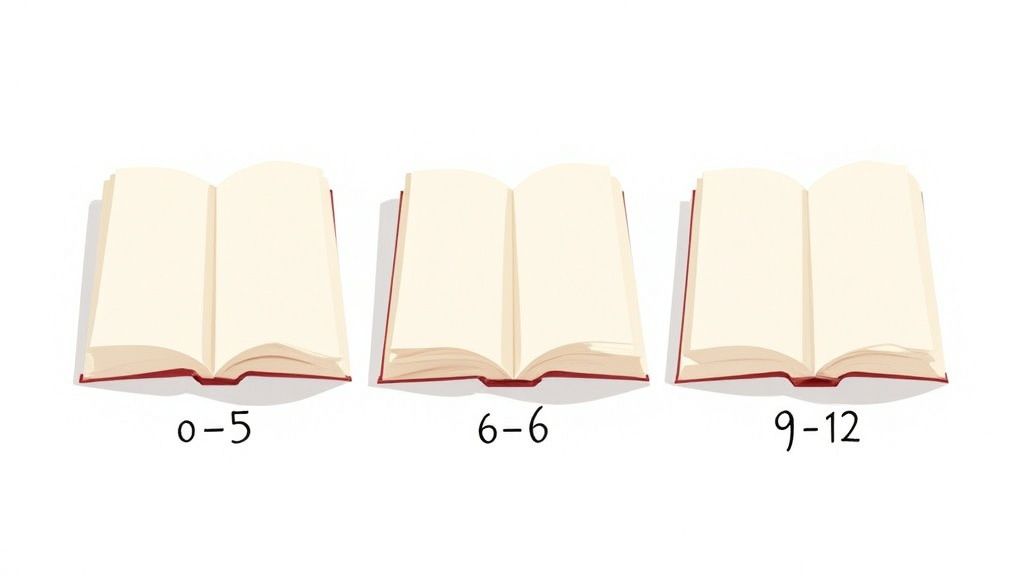
Fonts for Toddlers and Picture Books (Ages 0-5)
When it comes to our youngest readers, two words are everything: clarity and friendliness. At this stage, little ones are just beginning to recognize letter shapes. Your font needs to be their best friend on this new adventure—simple, open, and impossible to misinterpret.
- Go Big and Bold (ish): Large point sizes are your friend here. Pair them with friendly, rounded sans-serifs. Fonts like Lexend Deca or Poppins are fantastic choices because their letterforms are so clean and distinct.
- Keep It Simple: Now is not the time for fancy script fonts or anything too decorative that might muddy the waters. That single-story 'a' we talked about? It's a non-negotiable for this group.
The name of the game is building confidence. Every letter they recognize is a tiny win that encourages them to keep going. This is a huge part of visual storytelling, which you can read more about in our guide to creating compelling children's picture books.
Typefaces for Early Readers (Ages 6-8)
As kids start reading on their own, the font’s job changes a bit. Clarity is still a top priority, of course, but the focus shifts to creating a smooth, comfortable reading experience that helps build stamina. The training wheels are coming off!
The font at this stage needs to be a quiet cheerleader, guiding the eye effortlessly across the page without shouting for attention. It should feel familiar, but also just a little more grown-up.
Look for fonts with great spacing and a solid, balanced weight. A typeface like Andika is a real gem because it was designed specifically for literacy and new readers, offering incredible clarity that helps prevent common letter mix-ups.
Choosing Fonts for Middle Grade Novels (Ages 9-12)
Once you get to older readers who are tackling longer chapters, the goal is pure, uninterrupted readability. This is where classic, highly legible serif fonts really get to shine. Those little "feet" on serif letters create a subtle horizontal line that guides the eye, and some studies suggest this can even help reduce fatigue during marathon reading sessions.
Fonts like Lora or Merriweather feel more mature but are still incredibly easy on the eyes, both in print and on screens. This typographic shift is a powerful signal to the reader, telling them they're ready for a more substantial narrative journey. It's a crucial piece of the puzzle in the global font market, which is expected to rocket past USD 4 billion by 2025. Fun, readable typefaces are the backbone of children's publishing, and finding the right one for each age group is absolutely key. You can discover more insights about font statistics and trends on linearity.io.
Creating Harmony with Font Pairing
Once you've picked the perfect font for your story, you might think you're done. But what if you could make your pages even more engaging? This is where the real fun begins: pairing fonts!
Think of it like casting characters in a play. You need a big, charismatic star for your titles and a clear, reliable narrator for the main story. When you get the casting right, the whole performance sings. That's what good font pairing does—it creates a visual rhythm that pulls the reader in and makes turning the page an absolute delight.
The secret isn't just picking two fonts you like. It's all about contrast. Your title font needs to be the one that shouts, "Hey, look over here! This is exciting!" Then, your body font should gently say, "Now, get comfortable, and I'll tell you all about it." This clear difference creates a visual hierarchy, a natural roadmap that tells a child’s eyes exactly where to look first.
Building Your Typographic Team
Let's start with your main story text. This font is the foundation of your house—it has to be strong, dependable, and easy to live with. You’ll want an incredibly legible serif or sans-serif here, one that’s built for comfort over long reading sessions. It’s the quiet hero of your design team.
Now for the fun part: your title or "display" font! This is the personality, the flair, the bright red front door that makes people smile. Here’s your chance to pick something with real character—a playful script, a chunky slab serif, or a whimsical font that perfectly captures the mood of your story.
The golden rule of font pairing is simple: create enough contrast to be interesting, but not so much that it's chaotic. Let one font be the star of the show, and the other its brilliant supporting actor.
For instance, try pairing a bold, rounded heading font like Fredoka One with a clean, friendly body font like Poppins. Fredoka’s bubbly energy grabs your attention instantly, while Poppins steps back and makes the story effortless to follow. It’s a match made in typographic heaven!
Simple Rules for Successful Pairing
You don't need a design degree to make great font choices. Seriously! Just a few simple guidelines can help you create pairings that look polished and intentional, not accidental.
Here are a few proven strategies that always work:
- Pair a Serif with a Sans-Serif: This is the classic, can't-go-wrong combination. The contrast between the timeless, detailed serifs and the modern, clean lines of a sans-serif just feels right. It’s a timeless look.
- Use Different Weights from the Same Font Family: For a more subtle, cohesive feel, stick with one font "superfamily" like Lora. You could use Lora Bold for titles and Lora Regular for the body. The family resemblance guarantees they'll look great together.
- Contrast by Style, Not Chaos: Make sure your chosen fonts share at least one common trait, like a similar x-height or a general vibe (e.g., both are playful or both are elegant). This shared DNA prevents the page from feeling like a jumbled mess.
By thoughtfully pairing your fonts, you transform your book from just words on a page into a beautiful, cohesive, and unforgettable reading experience.
Navigating Font Licensing and Technical Hurdles
Alright, you've picked the perfect children's book font—the creative part is done! But before you pop the champagne, we need to talk about the practical side of things to keep you out of trouble later.
Think of font licensing like a permission slip. Just because you can download a font doesn't mean you can use it everywhere. Ignoring the rules here can lead to some seriously nasty surprises down the line.
For example, that font you found might come with a "desktop license," which is fantastic for designing your book on your computer. But that license usually stops there. It often won't cover using the font in a commercial product you plan to sell, like an e-book or a print-on-demand book. For that, you'll need to dig a little deeper.
Understanding Your Font's Permissions
Before you get too attached to a font, you’ve got to put on your detective hat and check out its End-User License Agreement (EULA). I know, it sounds boring, but this document is your treasure map—it tells you exactly what you can and can't do.
Here’s a quick rundown of the usual suspects you'll run into:
- Desktop License: This lets you install the font on your computer. It’s perfect for using in programs like Adobe InDesign to create your book layout.
- E-Pub License: This one is a must-have if you're making a digital version. It’s specifically for embedding the font into an electronic book file (like an EPUB or MOBI).
- Webfont License: Planning to show off your book on a website? You’ll need this license to use the font on your promotional page.
- Print-on-Demand (POD) License: Some font creators have special licenses for services like Amazon KDP or IngramSpark, where the font is used to create a physical book for each order.
A crucial term to look for is embedding. Your license must allow for it. This just means the font file gets bundled inside your e-book, ensuring your beautiful typography shows up perfectly on every Kindle, iPad, or Nook.
Technical Checks for a Flawless Book
Licensing is one piece of the puzzle; technical performance is the other. First off, make sure the font has a complete character set. Does your story have special symbols, or maybe names with accented characters? Check them all! There's nothing worse than finding a missing character when you're about to go to print.
This is a massive deal for personalized books. When you're creating stories that pull in a child's unique name and details, your font has to handle any letter or symbol thrown at it. To see how we tackle this with pictures, check out our guide on how we create custom character images.
The world of digital kids' books is exploding—the market for interactive stories is valued at around USD 3.2 billion in 2024. This incredible growth, highlighted in reports from firms like Verified Market Research, means our fonts have to be flawless on every screen, big or small. Getting these technical details right isn't just good practice; it's essential.
Got Questions About Children's Book Fonts? I've Got Answers!
Diving into the world of typography can feel like opening a can of worms, especially when you're creating something for kids. It's totally normal to have questions! Think of this as your go-to cheat sheet for all those nagging font queries.
Let's clear up some of the most common head-scratchers that pop up when picking that perfect children's book font.
What's the Best Font Size for a Picture Book?
Great question! For picture books targeting the 3-8 age range, you'll want to start somewhere between 16 and 24 points. This is a solid sweet spot.
But remember, every font is a little different, so the final size really depends on the typeface you choose and your page design. The golden rule? Always, always print a test page! Holding a physical copy in your hands is the only surefire way to know if the size and spacing feel right before you go all in.
Can I Just Grab a Free Font Off the Internet?
You can, but you have to play detective first! This is a huge one. So many fonts labeled "free" are only free for personal projects, like a birthday card for your grandma. If you're planning to sell your book, using one of those could land you in hot water.
My best advice? Stick to fonts with an SIL Open Font License (OFL) or another license that spells out "commercial use" in plain English. Always take a minute to read the license agreement—it's a small step that can save you a massive legal headache later.
Serif or Sans-Serif? What's the Deal?
Ah, the classic debate! It all comes down to the age of your reader. For the little ones just starting their reading journey (think ages 3-7), a clean sans-serif font is your best friend. The letters are simple and straightforward, making them much easier for developing eyes to recognize.
Once kids hit that middle-grade stage (around age 8 and up), a good, readable serif font can be a game-changer. Those little "feet" on the letters actually help guide the eye along, making it less tiring to read longer chunks of text. The name of the game is always clarity for your specific audience.
At Torah Tales, we obsess over finding fonts that are beautifully clear, super engaging, and just right for a cozy bedtime story. Ready to bring your child into the heart of a classic Jewish tale? Create their very own personalized adventure today
