

A Guide to Brilliant Book Cover Illustration
Let's be honest, a great book cover is so much more than just a pretty picture. It's your story's first—and most powerful—handshake with the world. For a children's book, especially a personalized one, that cover is what lights the spark, inviting a kid and their family into the adventure before they even turn the first page. An illustration, in particular, creates a sense of magic and personality that a simple photograph just can't touch.
Why Your Cover Illustration Is Your #1 Marketing Tool
That first glance is everything. Whether your book is sitting on a real-world shelf or showing up in an online search, the cover is doing all the heavy lifting. You've got maybe three seconds to grab someone's attention, hint at the story's tone, and convince a busy parent that this book is the one. A truly unique illustration is your secret weapon in that split-second battle for their imagination.
Think about it. A generic stock photo feels, well, generic. But a custom book cover illustration? That creates an instant emotional bond. It quietly says, "this world was built with care and creativity." For parents and grandparents hunting for that perfect birthday or Chanukah gift, this artistry signals quality and thoughtfulness. It turns a simple book into a keepsake they’ll treasure for years.
The Magic of a Personal Connection
Now, here's where things get really exciting: personalization. Can you imagine a child's face lighting up when they see a character on the cover of a book who looks just like them? This isn't just a gimmick; it’s a deeply profound experience. When we at Torah Tales use technology to transform a child's photo into a stylized illustration, we're not just putting them in the story—we're putting them at the very heart of it. That creates a sense of belonging and excitement that is off the charts. It makes the story truly theirs.
This personal touch completely changes the game. The book is no longer just another bedtime story; it becomes an unforgettable family treasure. The cover acts as a mirror, showing the child their own heroic potential and whispering, "You are the star of this adventure."
A cover illustration doesn’t just sell a book—it sells an experience. It promises a unique journey, and when personalized, it delivers on that promise by making the child the undisputed hero of their own tale.
It's What the Market Wants
This move toward illustration isn't just a gut feeling; the data backs it up. Across the publishing world, artistic covers are making a massive comeback. Take romance novels, for example. Back in 2012, you'd see mostly photographic covers on the New York Times bestseller list. Fast forward to 2025, and the tables have completely turned: 100% of romance bestsellers on that list now feature illustrations.
Why the change? A big part of it is driven by social media, where visually unique, artistic covers are far more shareable and eye-catching. If you want to dive deeper into this, there's a fantastic video analysis that breaks down the rise of illustrated book covers and what it means for publishing today.
Turning a Photo Into a Storybook Character
There’s nothing quite like the look on a child’s face when they see themselves as the hero of a story. It's pure magic! This is where a personalized book cover illustration truly sings, transforming a beloved photo into a whimsical, charming character ready for an adventure. And trust me, getting there is way more fun and straightforward than you might imagine. It all starts with one crucial piece: the right photo.
Your source image is everything. Think of it as your golden ticket. You'll want to find a high-quality, forward-facing picture with great, natural lighting. Make sure the child's face is clear and easy to see—no hats casting shadows, no sunglasses hiding their eyes. A big, happy smile goes a long way and gives the artist (or AI!) fantastic material to work with to capture that one-of-a-kind spark.
Crafting a Simple and Effective Creative Brief
Whether you're tapping into an AI tool or teaming up with a real-life artist, a clear creative brief is your best friend. This doesn't have to be some formal, complicated document! Just think of it as a handful of key pointers to guide the creative process. Remember, the goal isn't a perfect portrait; it's a recognizable and enchanting character that feels right at home in a storybook.
Your brief is all about highlighting the must-haves while letting the artist do their magic. Here’s what I always recommend including:
- Key Recognizable Features: Point out the little things that make them them. Think: "Please keep her signature curly pigtails," or "His bright blue eyes are a must-have."
- Desired Emotion: How should the character feel? Adventurous? Curious? Maybe a little sleepy and gentle? A few words like "joyful and brave" can really set the perfect tone.
- Art Style Adjectives: Give a feel for the vibe you're going for. Simple descriptions like "soft and dreamy," "bright and cheerful," or "whimsical and playful" do wonders to align the character with the overall book cover illustration.
This simple bit of direction forges a direct line between the visual appeal of the illustration and that heartwarming emotional connection a child feels, which is what ultimately inspires a grandparent or parent to make a purchase.
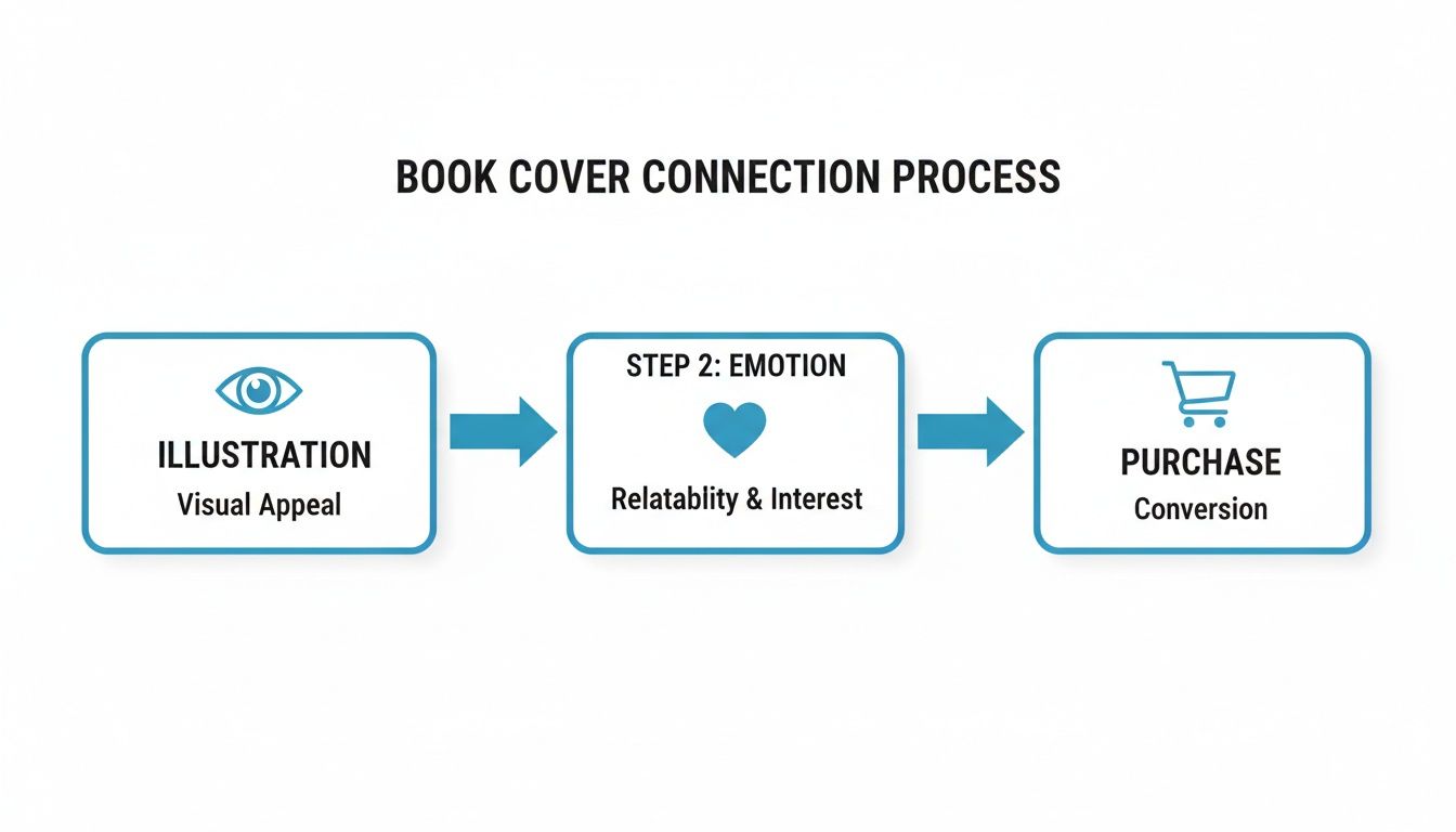
This little flow really nails it—a compelling illustration grabs the eye, creates a powerful emotional bond, and seals the deal.
A great character transformation is all about balance. It should capture the essence of the child—that familiar smile, the specific hairstyle—while seamlessly blending them into the imaginative world of the story.
When you get it right, a single snapshot becomes the foundation for a hero ready for countless journeys. The final character should feel deeply personal yet perfectly suited to the world you’ve built. If you're thinking about hiring a pro, it's worth taking a moment to understand what makes a great children's book illustrator, as it can really enrich the collaboration. With a great photo and a little clear direction, you're on your way to creating a character that truly leaps off the page.
Building a Captivating Color Palette
Color is pure magic on a book cover. It's not just about making things look pretty; it's the first emotional handshake with your reader. For a children’s book cover illustration, the right palette can whisper a promise of a gentle bedtime story or shout about a thrilling adventure. This is your chance to grab a child's imagination and a parent's heart right from the get-go.
Don't just take my word for it—the power of color is a huge deal in the massive $28.1 billion U.S. publishing industry. Big publishers track color trends obsessively. Recent data showed white usage on covers skyrocketed from 52% to 79%, giving off a clean, modern vibe. Blue, a perennial favorite, held strong at 62%.
What's really fascinating is how colors respond to our collective mood. Green saw a 12% surge, likely tapping into a feeling of hope. And get this: joyful pinks leaped an incredible 260% on bestseller lists between 2021 and 2023, partly thanks to social media trends! If you're a data nerd like me, you can dive deeper into how these color statistics shape book sales and see just how strategic this all is.
Matching Colors to Your Story’s Soul
Every story has a heart, a core feeling you want to share. Your color palette is the fastest way to communicate that feeling. Before you pick a single hue, ask yourself: what’s the soul of my story? Is it a lively Chanukah tale full of energy, or a soft, gentle story about Creation?
Let’s brainstorm a few real-world examples:
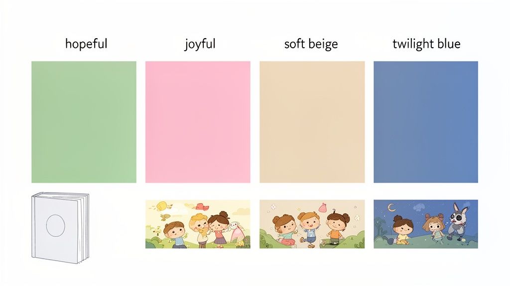
- A Creation Story: I’d lean into earthy, organic tones. Think soft beiges like sandy shores, gentle sky blues, and deep, hopeful greens of new leaves. These colors instantly create a sense of peace and primordial wonder.
- A Chanukah Adventure: Go for it! This is where you can break out the bright, celebratory colors. A vibrant palette of brilliant blues, the warm glow of yellows, and maybe a touch of celebratory gold will capture the joyous spirit of the Festival of Lights perfectly.
- A Bedtime Story: Here, your mission is to soothe. I always recommend a mix of twilight blues, soft lavenders, and muted pinks. These colors are a visual cue to both parent and child that it's time to slow down and snuggle in.
Choosing the right color palette is all about connecting the visual feeling of the cover with the emotional journey of the story inside. The table below breaks down a few popular approaches for bedtime stories.
Bedtime Story Color Palette Guide
| Color Palette | Primary Emotions Evoked | Ideal For Story Type |
|---|---|---|
| Twilight Blues & Lavenders | Calm, Serenity, Dreaminess, Peace | Classic bedtime rhymes, stories about stars and dreams. |
| Pastel Pinks & Soft Yellows | Warmth, Coziness, Gentleness, Love | Sweet stories about family, friendship, and cute animals. |
| Earthy Greens & Soft Beiges | Nature, Grounding, Wonder, Security | Tales set in nature, stories about growth or creation. |
| Muted Jewel Tones | Magic, Mystery, Comfort, Richness | Fantasy adventures, stories with a touch of gentle magic. |
Ultimately, the best palette is one that feels authentic to your story's heart while being visually inviting.
Finding That Perfect Balance
One of the biggest mistakes I see is what I call "color chaos"—throwing every bright, loud color onto the cover. Yes, kids love vibrant shades, but an explosion of neon can feel jarring, especially for a book meant to be read before sleep.
The secret is all about balance.
A truly fantastic children’s book cover illustration often pairs one or two bold, eye-catching colors with softer, more muted tones that act as a supporting cast.
The goal is to create a design that is visually exciting enough to capture a child's attention, yet soothing enough to feel like a warm hug at the end of the day.
Think about a cover with a character in a bright, joyful pink outfit set against a dreamy twilight-blue background. That pop of pink makes the character the star of the show, but the gentle background keeps the overall feeling calm and inviting. It’s this thoughtful harmony that makes a cover not just beautiful, but perfect for its purpose.
Mastering Composition and Typography
A brilliant book cover is more than just a pretty picture; it’s a masterclass in visual storytelling. Even with the most adorable character and a perfect color scheme, the way you arrange everything on the page—the composition—and the style of your text—the typography—are what truly bring it to life. Getting this right is the secret to a polished, professional cover that just begs to be opened.
The whole point is to guide the reader's eye right where you want it to go. You don't need an art degree to pull this off! One of the simplest and most powerful tricks in the book is the rule of thirds.
Just imagine your cover has a tic-tac-toe grid laid over it. Instead of plopping your main character right in the dead center, try placing them along one of the lines, or even better, where two lines cross. This simple shift creates a sense of movement and energy that's far more engaging.
Creating a Clear Focal Point
Every fantastic cover has one undeniable star of the show. This is your focal point, the very first thing that grabs your attention and instantly tells you what the book is about. For a personalized story, that star is almost always your wonderful, illustrated character.
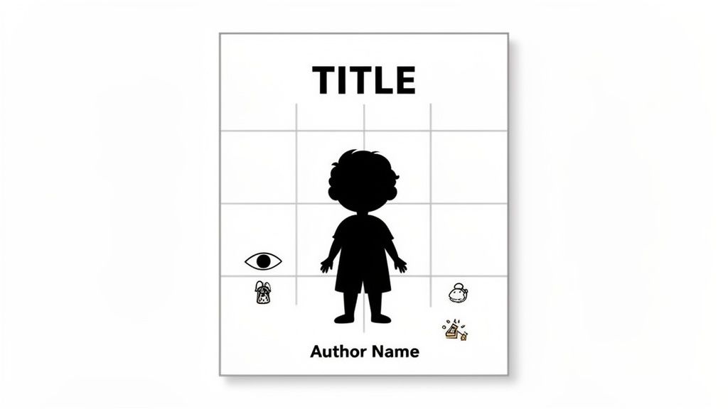
Want to make sure your little hero pops right off the page? It’s easier than you think:
- Play with Contrast: Position your character against a background that has a different color or brightness. A child in a bright yellow raincoat against a soft, dark, rainy background? Instant focus!
- Go Big: Don't be afraid to make your character noticeably larger than other things on the cover. Size immediately signals importance.
- Use Leading Lines: This is a clever one. Use elements in the scenery—like a winding garden path, a fence, or a moonbeam—to subtly point directly at your character.
When you create a strong focal point, you eliminate any visual clutter or confusion. You’re essentially telling the reader, "Look here! This is who our adventure is about," which builds an immediate, heartfelt connection.
Choosing the Right Typography
Okay, let's talk about the unsung hero of cover design: typography. The fonts you pick are the secret sauce that ties the whole look together. They should feel like a natural part of the illustration, not something that was just slapped on at the end.
For children's books, and especially for cozy bedtime stories, you have two main jobs here: making it easy to read and setting the right tone.
The font has to be crystal clear for parents reading aloud and for little ones who might be starting to recognize letters. Steer clear of super fancy or complicated script fonts for the title. Instead, look for friendly, clean typefaces that feel warm and welcoming. A playful, rounded font is perfect for a funny romp, while a softer, classic serif font can signal a gentle, timeless tale.
Your typography shouldn't fight with the illustration for attention; it should dance with it. Think of it as the cover's voice—it sets the mood before the first page is even turned.
Nailing the typography is a huge win for your cover. If you really want to get into the nitty-gritty, we've put together a fantastic guide on choosing the perfect children's book font that will help your title and author name sing. Remember, composition and typography are a team, and when they work together, they promise an amazing story is waiting inside.
Getting Your Cover Ready for Print and Digital
Alright, the moment of truth! Your incredible book cover illustration is finished, and it looks absolutely amazing on screen. Now, let's get it ready for its big debut, both in the hands of a child and online.
This final step is so important because getting your files ready for print and for digital screens are two totally different ballgames. They speak completely different technical languages, and translating between them perfectly is the secret sauce to a professional-looking book.
First up, let's tackle color. Your computer screen glows using an RGB (Red, Green, Blue) color model. Think of it as mixing light—it’s why the colors look so vibrant and almost luminous. But paper doesn't glow! Printers use a CMYK (Cyan, Magenta, Yellow, Black) model, which works by subtracting light as ink is absorbed by the paper.
This isn't just a tiny detail; it's a make-or-break one. If you send an RGB file to a commercial printer, the colors can come back looking disappointingly dull, muddy, or just... off. To make sure the colors you fell in love with on your screen are the same ones that appear on the page, you always need to export a separate CMYK version just for printing.
Mastering Your Files for Print and Digital
Beyond the great RGB vs. CMYK debate, a few other techy details are crucial for a flawless finish. Getting these right will give you that sharp, crisp print quality you're dreaming of and ensure your cover looks just as stunning as a tiny thumbnail online.
Here’s a quick-glance table to keep these specs straight. I recommend bookmarking this!
| Specification | Print Version (Physical Book) | Digital Version (eBook/Online) |
|---|---|---|
| Color Model | CMYK | RGB |
| Resolution | 300 DPI (Dots Per Inch) | 72-96 PPI (Pixels Per Inch) |
| File Format | High-quality PDF or TIFF | JPEG or PNG |
| Bleed | Add 0.125 inches on all sides | Not required |
So, what on earth is bleed? It’s simply a little extra artwork that extends beyond the actual edge of your cover. During printing, books are trimmed to size, and having that extra bit of image ensures you won't get any ugly white slivers along the edge if the cutting machine is off by a hair. It’s a total lifesaver.
For digital files, a super high resolution just bloats the file size, so sticking to a web-friendly PPI is perfect. If you’re more of a visual learner, pop over to our complete image guide for custom books for a full walkthrough.
The Thriving World of Children's Book Art
Taking the time to get your files technically perfect is more important than ever. Why? Because the market for children's book illustration is absolutely booming! A recent survey of 1,500 global artists showed that while other illustration fields might be facing challenges, children's and YA book covers are a creative powerhouse.
The print market is still incredibly strong, clocking in at $14.92 billion globally. That tells us that families still truly cherish the experience of holding a physical book. It's an exciting time to be creating! You can dive deeper into these trends in the 2025 State of Illustration report.
Finalizing your files is really the last creative step in the process. When you give your printer and digital retailers perfectly formatted artwork, you're guaranteeing your book cover will look polished, professional, and absolutely captivating no matter where it’s seen.
Answering Your Top Questions About Book Cover Illustrations
Jumping into the world of personalized book covers is a blast, but I know it can bring up a few questions. From picking the perfect photo to getting the cultural details just right, let’s walk through some of the most common things people ask when creating a storybook that’s truly one-of-a-kind.
Getting these details right is what turns a fun idea into a keepsake that families will pull off the shelf for years to come. My goal is to make this whole process feel easy and exciting, so you end up with an illustration that’s even better than you imagined.
What Kind of Photo Works Best for a Custom Character Illustration?
This is the big one—the question I hear most often, and for good reason! The quality of your photo is the foundation for the entire illustration.
For the best results, you'll want a photo that is:
- Clear and high-resolution: No blurry or pixelated shots.
- Facing forward: A straight-on view of the face is ideal.
- Well-lit: Natural light is your best friend here; it avoids harsh shadows.
Try to avoid photos with hats, sunglasses, or pictures taken from super high or low angles. We need to see key features like eye shape, hairstyle, and the curve of their smile. Honestly, a happy, natural expression almost always leads to the most charming illustration—it gives the artist (or AI!) the perfect reference to capture your child’s unique spark.
How Do I Ensure the Cover Appeals to Jewish Families?
Creating a cover that truly connects with Jewish families is all about celebrating shared heritage with warmth and authenticity. It’s not about adding big, obvious symbols everywhere, but about weaving in meaningful, subtle details that feel like home. This is what makes the book a perfect Chanukah or upsherin gift.
For a Chanukah story, for example, you could have a beautifully lit menorah in the background or maybe some whimsical dreidels spinning in the corner. If the story is about Creation, perhaps a delicate pomegranate tree or a subtle Star of David woven into a blanket pattern would be a perfect touch.
The secret is respectful authenticity. When you pair warm, family-centric imagery with a personalized character who is interacting with these elements, the book cover feels both deeply meaningful and incredibly personal.
It’s about creating a world where a child sees their own life and traditions reflected in a magical, storybook way. That connection is what makes the book a real family treasure.
Can I Request Changes to an AI-Generated Illustration?
That’s a great question, and it really gets to the heart of how this amazing technology works. The short answer is: it depends on the service you're using.
Our AI, for instance, is specifically designed to create a consistent, beautifully stylized character that perfectly matches the book's overall art style. It all starts with the photo you provide. While the system is fantastic at capturing a likeness—those signature curls or that specific eye color—the goal is a charming, artistic representation, not a photorealistic portrait.
With AI-driven personalization, the magic is in that seamless transformation from a real-life photo into a storybook hero.
Will the Personalized Character Look Consistent Throughout the Book?
Absolutely! This is one of the most important parts of the entire experience. Consistency is what makes the story feel real and immersive for a child.
Here’s how it works: a single character model is created from the photo you upload. That same model is then posed differently for each scene throughout the book. This means your little hero is instantly recognizable on the cover and on every single page of their adventure.
This unwavering consistency is what makes a child feel like they are truly inside the story. It turns reading time into an unforgettable journey where they are the star.
Ready to see your child become the hero of their own story? At Torah Tales, we turn beloved photos into beautiful illustrations for personalized Jewish storybooks. Create your custom book today!
